

scroll down to see the new stuff or click on the new PDFs
I erased the type from the page because it was too cheesy.
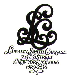
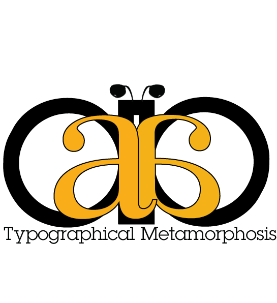
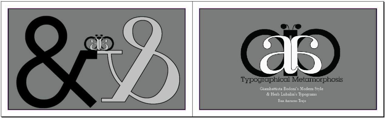
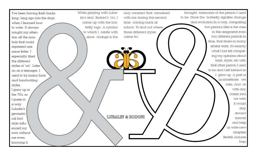
I left it here, for you to see from where the idea for the butterfly logo came from.
I really like the way the logo looks now. I hope you let me keep it. scroll to see it on the back cover.
This is the last version of the booklet.
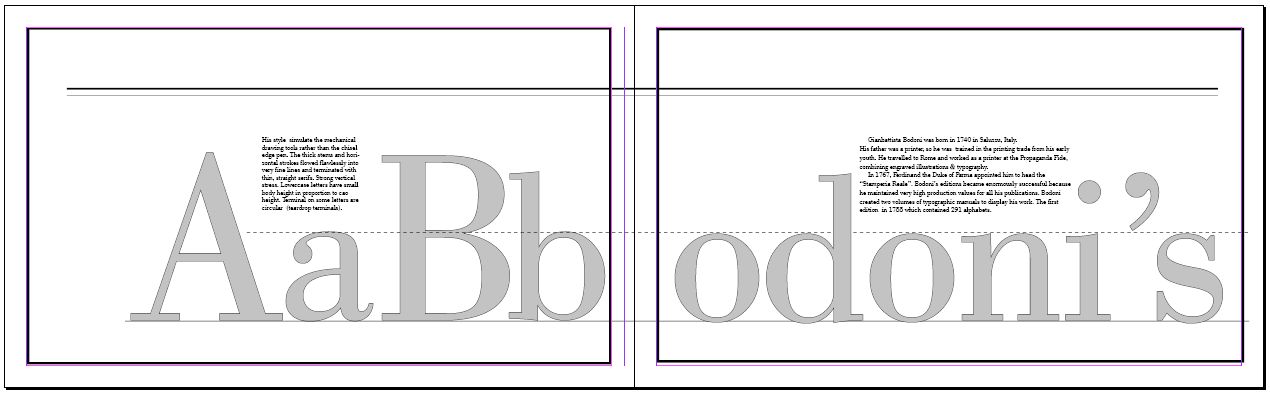
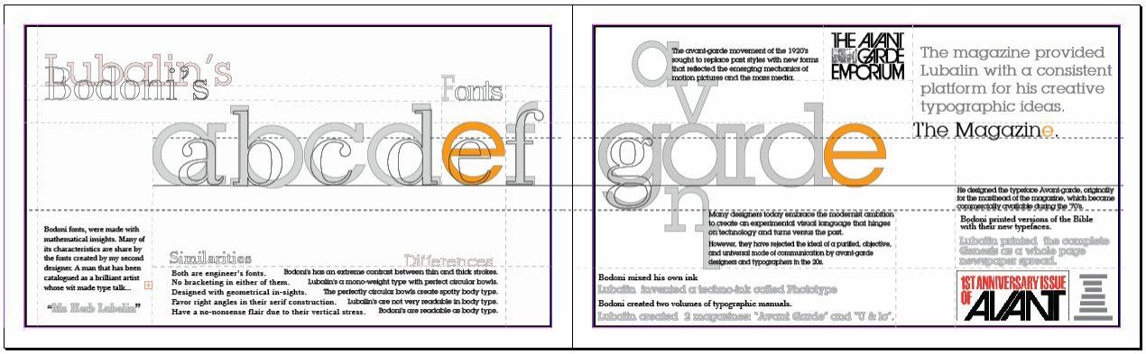
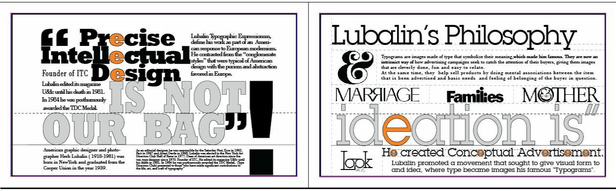
I uploaded screenshots (65% of its real size) so you can see how the 2 page spread looks like when the pages are together. That is why some of the text is not very clear.
the last ones are the back and front covers.
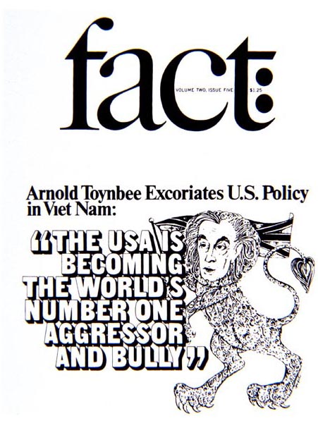
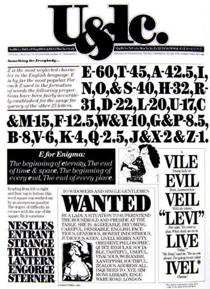
Page from Herb Lubalin's magazine
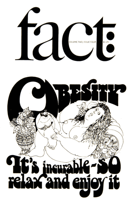
Page on Lubalin's Fact magzine
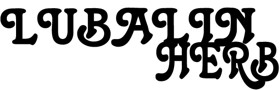
The font above is not Lubalin's but i think it similar looking to the one on the Lubalin, Smith, Carn logo
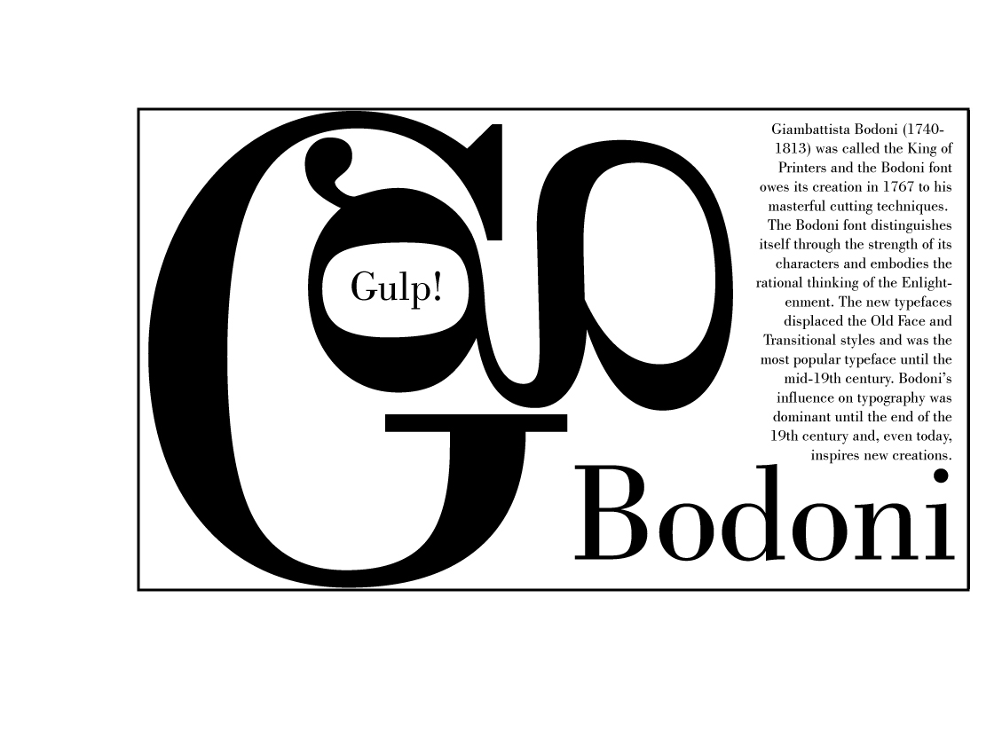
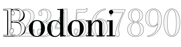
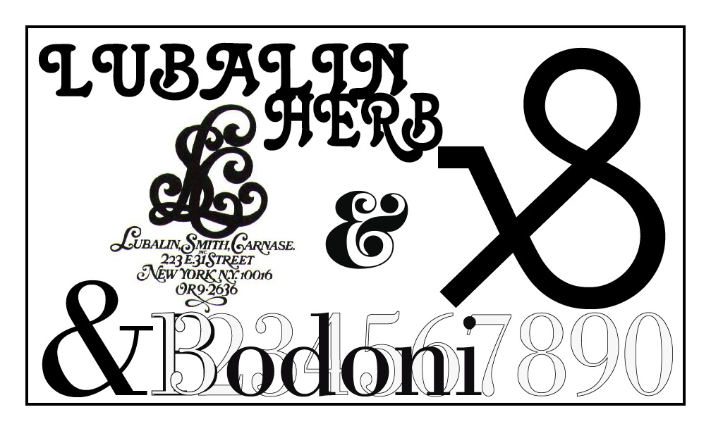
I played with the numbers on the Bodoni's typeface.
I don't know if I should add any if these images to the booklet
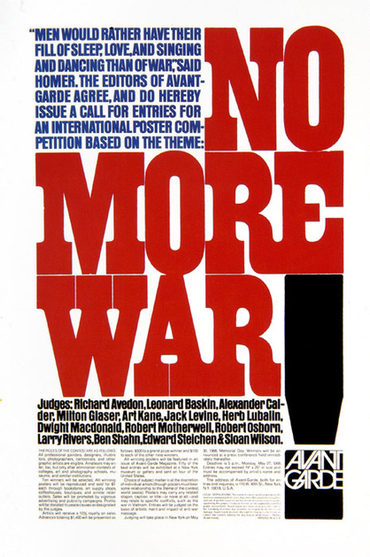
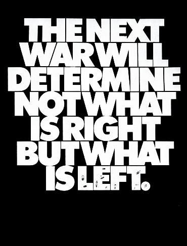
The " no more war" is one of his layouts that I imitated.
I tried to imitate the rectangular blocks of text all through the booklet and the big Rockwell type and exclamation mark in one page.
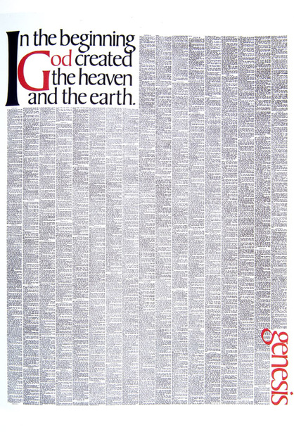
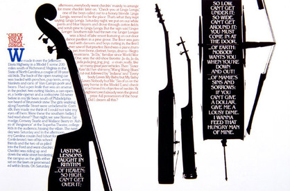
I particularly like the layout of the Genesis and the ones of the instruments . I just noticed others associate Rockwell type pile up too!


I'll be back on the 12 so we can review the spreads
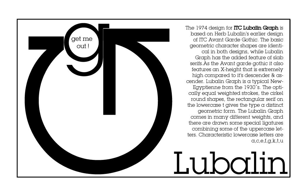
Playing with position to create typograms:
This emulates the Lyon's trainer getting her head inside the Lyon's mouth.
This one I Don't like it because the Abc's are too much.
scroll down to see the new stuff
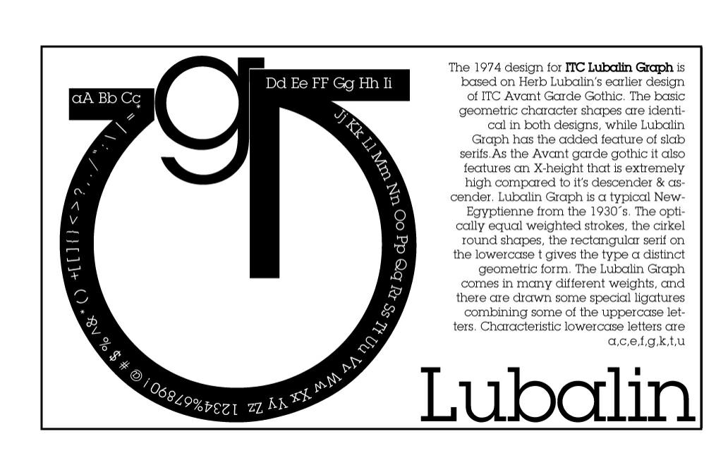
A lower g stuck inside an underground pipe.
I'm not sure about this one ...

I did one last page early this morning
But frankly, I don't like it.
I only like the Bodoni part on the bottom with the 13 superimposed on the "B".
Then again, I don't like these last two.
A mom cuddling and kissing a baby on her lap.
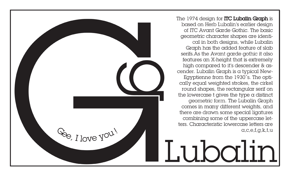
Gee, I love you !
I think is cute that "gee"
is an expression of endearment but also is the gutural sound of the name of the letter.

I tried to emulate the same type of block-arrangement than this.
Click the link on the right to see the PDF version of the entire type exercise.
In the page to the right:
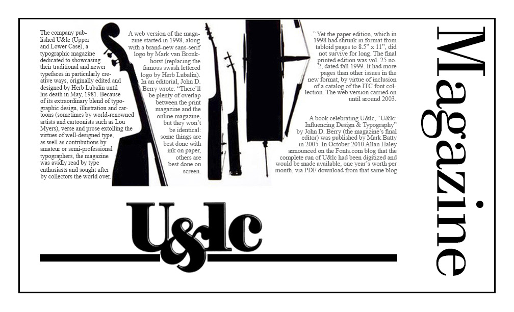
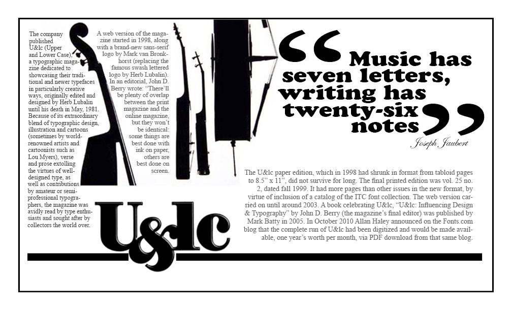
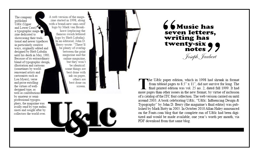
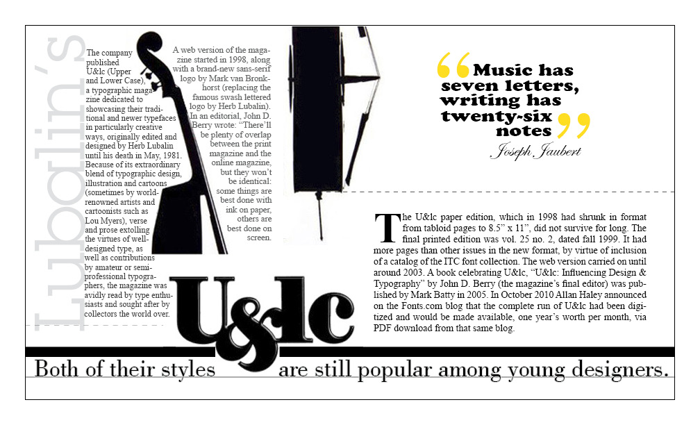
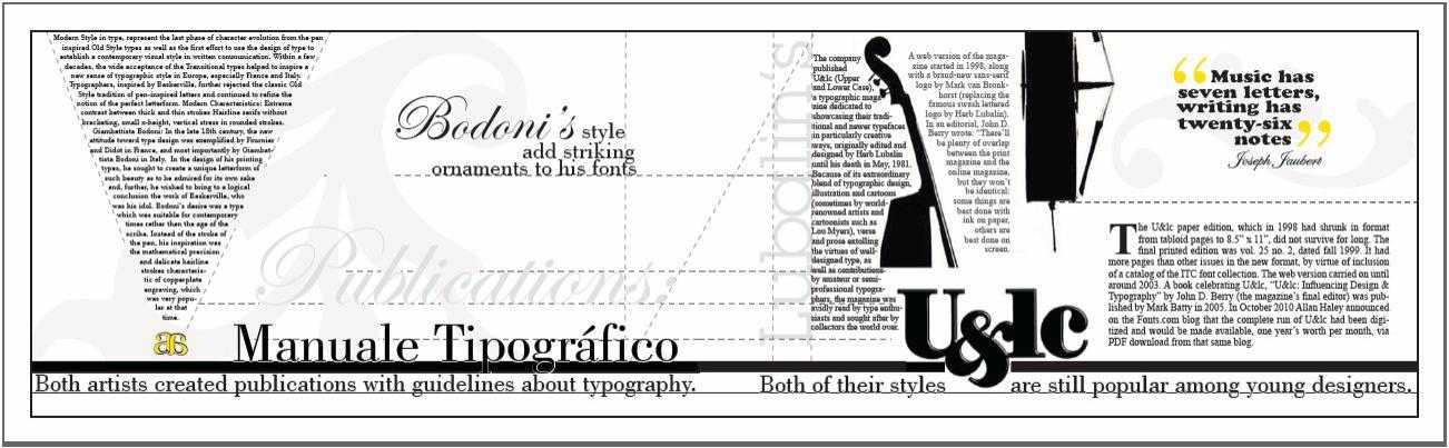
I wanted to do a spread with examples of their work. The page in here talks about Lubalin's U&lc magazine
I like how the U&lc logo look under the bass. I think that the "U" gave the impression of completing the lower part of the musical instrument.
This is an old version to see the latest version, see PDFs links on top of the page and jpg on top.
I tried to emulate the same type of block-arrangement also in this one.
but I added the U&lc logo because the way the the 2 posters were positioned together it looks like its a continuation.of the bass
I'll experiment adding a little bit of color to one or two of the text blocksor to the quotation, as is done in the example down below at the bottom of this page.
I'll be working on a way to add this page below and the typograms I did yesterday into the booklet.
I'll make a transition page showing samples from their magazines & typefaces.
see pdf ( on top of this page) of the whole booklet
The above is a screenshot from my desktop ( snniping tool) tat s why the definition is so bad. to see original click on the PDFs' links at the top of this page.